Music Playlist Management
Summary
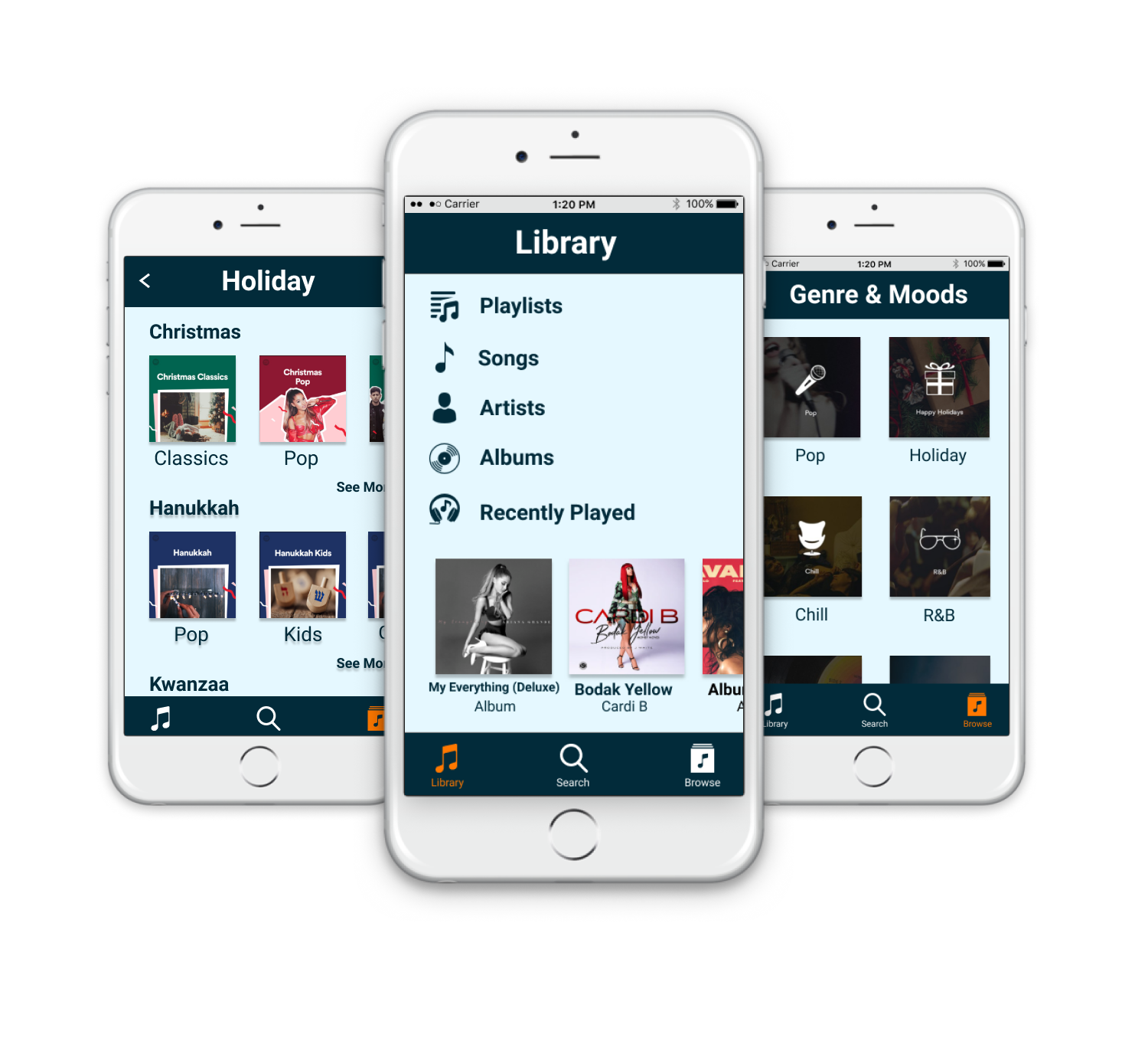
Managing and organizing playlists is one of the most frustrating and time-consuming aspects using music platforms. So, I worked with a team to research pain points. The result is an app prototype that demonstrates improved usability flows and features that make for a more enjoyable experience.
Skills & Tools
User Research
Competitive Analysis
Wireframes
Heuristic Evaluations
Figma
User Research
We interviewed 9 people to learn about how they manage their music and what they liked or disliked about different music platforms. From the 3 people I interviewed, the main insight I obtained is that people often like to create and select playlists on moods or tasks. For example, a Computer Science major said that she often doesn’t enjoy coding so she listens to upbeat music to improve her mood.
Usability Testing
As a team, we created 10 tasks and selected 1-3 tasks for users to perform that were relevant to how they usually manage playlists. From the 4 users that I observed, I learned that Spotify has many features that users are unaware of because there are no affordances that this function is possible.
3 out of the 4 people I observed added songs to a playlist one by one because they didn’t know you can select and drag multiple songs at once. In the image below, one user left-clicked songs one by one to add to a playlist
Another insight is that since songs in playlists are ordered from date added, users get tired of the songs toward the top of the list or feel that the mood/type of those songs are no longer relevant to that playlist. However, they still wanted to keep older songs because they brought back past memories and would listen to them occasionally.
In the image below one user said, “The first 20 songs I’m already very familiar with and I get really bored of. But, I don’t want to delete them because I still like them. I’m tired of “Summer” but I know I like “Keep it Mello” so I’ll start it from there.
Competitive Analysis
We conducted 9 tasks ourselves that related to creating playlists, managing playlists, and discovering new songs. For each task, we compared 1 platform with a good user experience workflow and 1 with a bad workflow. The platforms we used include Spotify, Youtube, SoundCloud, Apple Music, and PI Music Player.
One of the tasks I conducted was to I select multiple songs from an old playlist to add to a new one. I performed this task on Spotify and Apple music and found that Apple Music offered a better workflow for this task as explained in the images below.
Discoverability is not very good on Spotify because there was no indication that I could drag songs from one playlist to the “New Playlist” button.
Additionally, there was no feedback or confirmation to let me know that a new playlist was successfully created and was auto-named very vaguely based on the original playlist the songs came from.
Compared to Spotify, Apple music offered a better user experience for this task because it was more intuitive and efficient. I could press command to select multiple songs and command+click to pull up an option menu. I was impressed by how Apple Music immediately redirects you to the new playlist and highlights the name of it which alerted me to rename it.
Wireframes
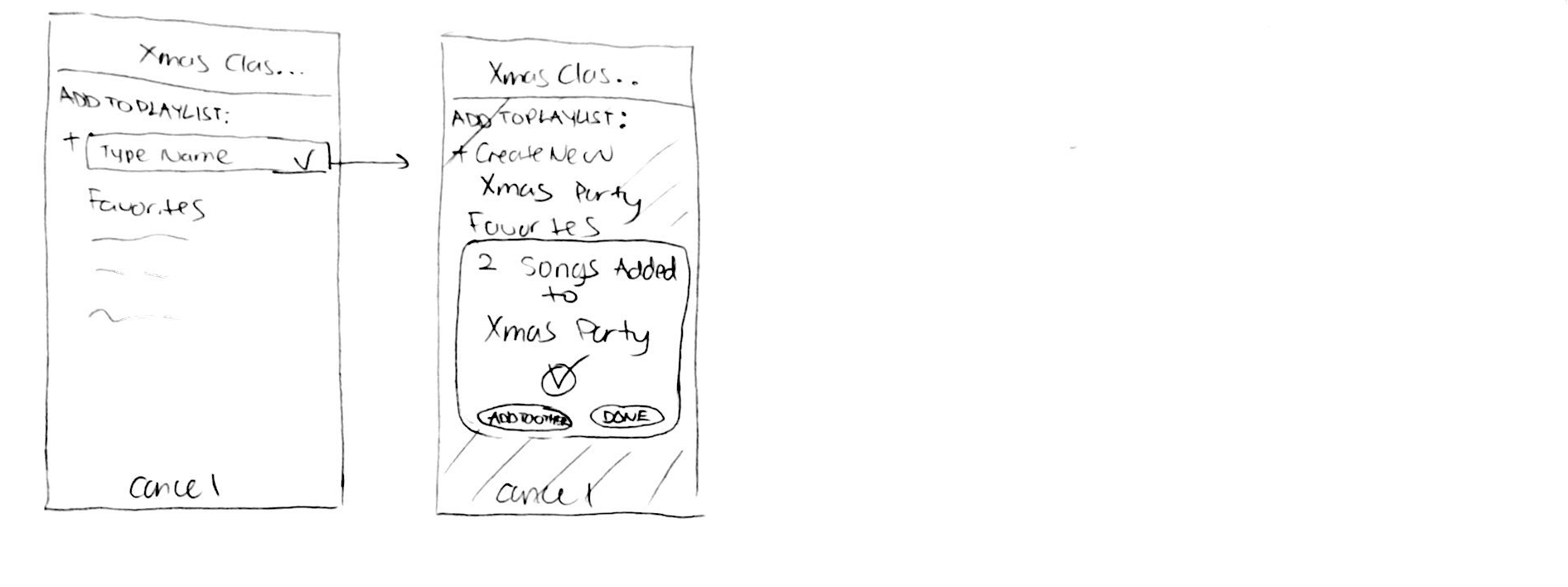
Our team decided to brainstorm wireframes for two different tasks. The first it to create a Playlist for an upcoming family Christmas Party filled with Christmas Classics. The second is to manage a “Girls Pop” Playlist by removing songs you don’t like anymore. By combining good features of existing music platforms with my own ideas, I created the wireframes below.
Final Wireframes
Final Mockups and Design Decisions
These are the highlights of my design decisions:
Decision: Pressing “dislike” to archive a song in a separate list within each playlist (Distinguishing Feature).
One of the main distinguishing features is the “Dislike” or archived section within a playlist. The idea came from users we interviewed who stated that they usually skip songs in their current playlist that are overplayed, not fit for the mood, or just not appealing to them, but do not want to permanently remove from the playlist. In this section, users can restore songs back into the playlist by pressing the "like" button.
Decision: 3 button navigation bar with browse encompassing radio, genre, and mood
We discovered users have difficultly distinguishing navigational content in the competitors’ apps. Therefore, we decided to put "Radio" under "Browse", which is the general section for discovering music. This is the same reason we put Genre and Moods together instead of separating them as Spotify does.
Decision: Replacing navigation bar and back button with cancel button
The cancel button replaces the navigation bar and the back button is removed from the header bar whenever the user is in the middle of a task or function. This reminds users they are in the middle of a task and prevents users from accidentally quitting the task. The cancel button also returns the user to where they were before they started the task which is more efficient than clicking on a back arrow multiple times to return to where they started.
Decision: Naming a playlist after selecting songs to add to a new one
When creating a new playlist, our app enables the user name the new playlist on the same page as the list of other playlists in order to reference others playlists when creating a new one. This prevents the user from giving the new playlist a name that overlaps with an existing playlist which creates later confusion. This decision is influenced by the “error prevention” and “flexibility and efficiency of use” heuristic to make this task easier for users.
Final Prototype
We created two prototypes to demonstrate the user flow two primary tasks that also show the main features of our app that make managing music a more enjoyable experience.
Task 1: Create a Playlist for your upcoming family Christmas Party filled with Christmas Classics
Task 2: Manage your “Girls Pop” Playlist by removing songs you don’t like anymore


